From blank sheet to street
Part 1: Designing the Beryl Bike
When we started on our latest adventure, bringing bike share to cities around the UK, there was lots to figure out: how our app would work, what the business model would be and how we would collaborate with local authorities to build a bike share that worked for them. However, we knew that we had to get the most important element right: the bike itself.
To have the best bike on the market, you have to have the best team. So we asked Ben Serotta to join the Beryl Design team, led by Dan Barnes, on the journey. We wanted to create a bike that would be fit for a new kind of bike share service, one that our users could fall in love with. Ben is a celebrated bike frame designer - previous riders who’ve benefited from one of his frames include the US Olympic Track Cycling Team. Ben can usually be found in his design studio in Saratoga, New York State, but we caught up with him on a recent trip to London to find out more about the process of designing a bike, from a blank sheet of paper to the first version on the street.
Hi Ben! When you were given a blank sheet to start designing the Beryl Bike, where did you start?
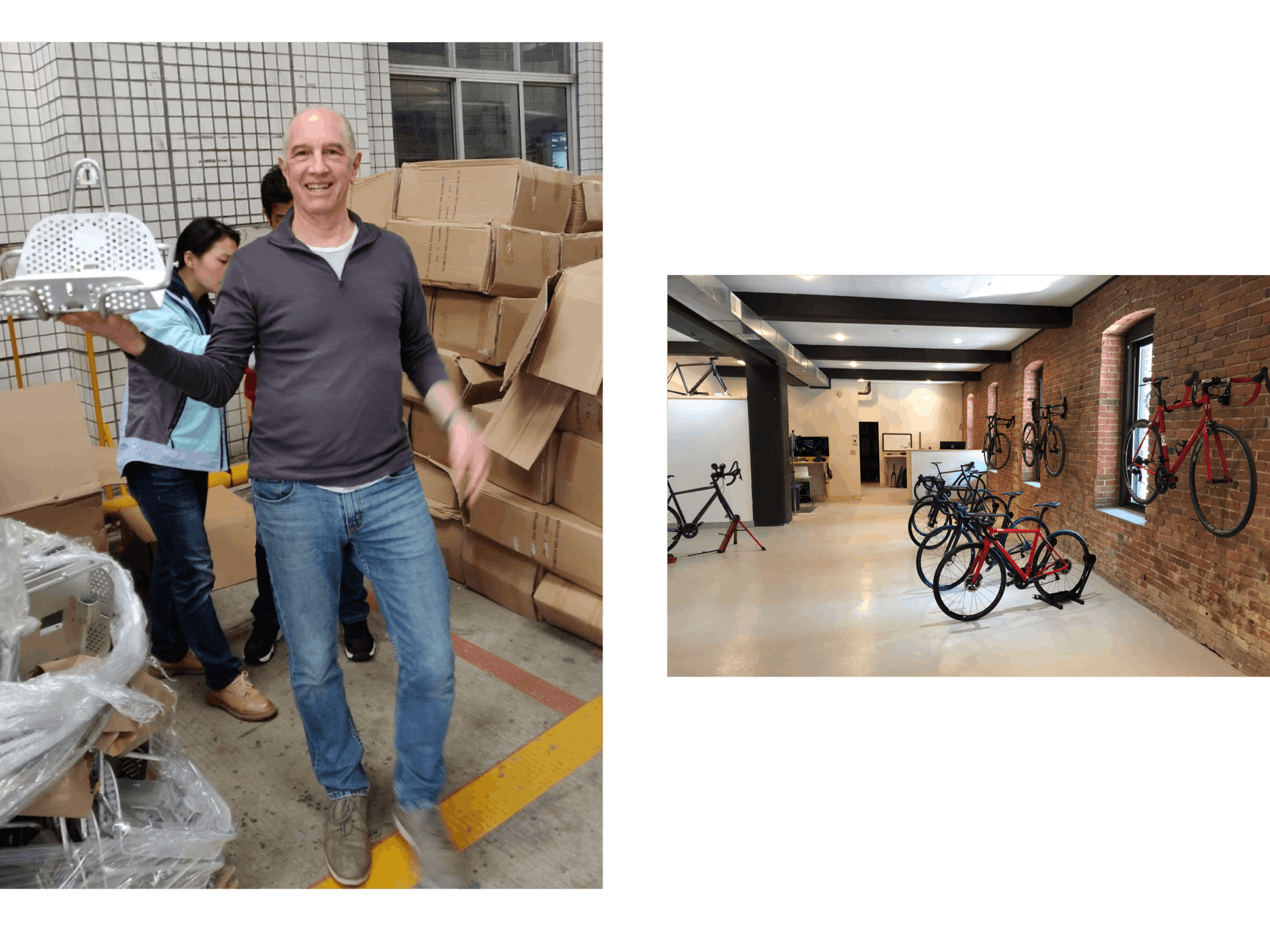
Even though the Beryl Bike will exist in the thousands, I started as I do with all my frames: by understanding the user and the customer. When I build custom bikes in my studio, usually the user and customer are the same person, but in the case of Beryl, I had to take into consideration both what the rider would want, and the needs of Beryl as a business.
How did you go about understanding the user?
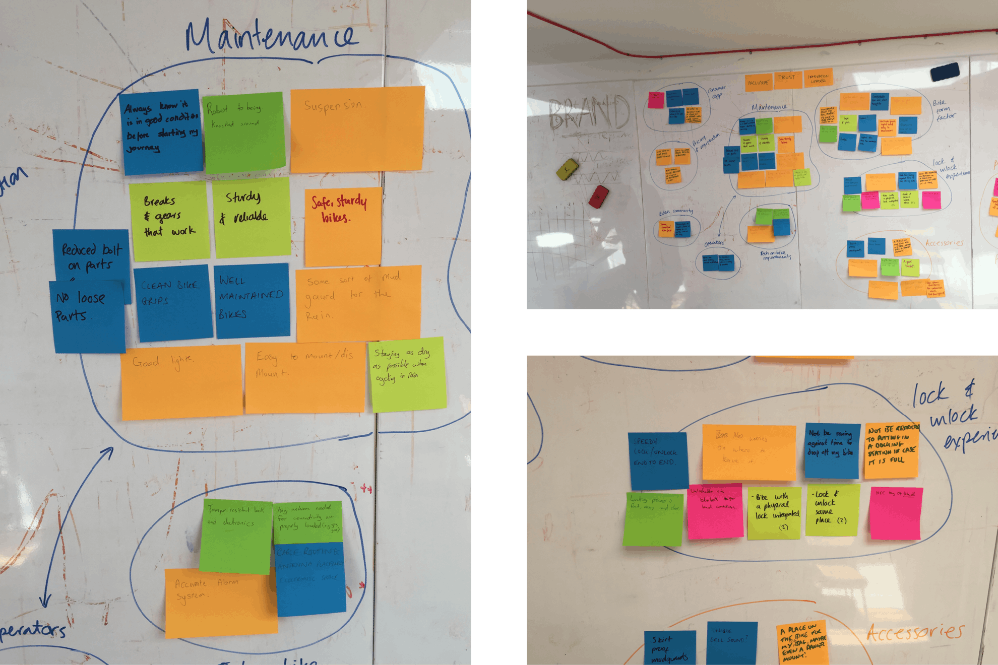
Right at the start of the project, I worked very closely with Michelle in the Beryl design team to interview lots of different people. We were really trying to understand people’s experience of shared bikes and how they use them. Michelle’s work on different bike share “personas” was really important in the initial stages. Of course we interviewed lots of people who already use bike share and are keen cyclists, including the Beryl team. But we also made sure to talk to people who aren’t bike share fans to understand the barriers they have to getting on a shared bike and to cycling in cities more generally. That research was key to making sure we were designing a bike that would appeal to as broad a section of users as possible.
What were the key things the user research highlighted?
Everyone has a different idea of what makes a perfect bike, but some themes came up time and time again. Users want a bike to be practical without being too heavy, and to adjust easily to fit their height. Safety is very important to users, as is being able to rely on the bike. Above all, users want a bike that feels fun and lets them enjoy the city. They want the sense of freedom that a bike allows.
After gathering all the information, we compiled a list of design targets; a list of characteristics we wanted to aim for. For example, we knew we had to have gearing that would let people get some speed up in the city. We also wanted to increase the “fit” range as much as we could, making our bike suitable for shorter and taller people at the same time.
Once you had the design targets, how do you go about putting pen to paper?
Actually, before designing, first we went to Eurobike, the annual bike industry event, to see if anyone already made a bike that fit our specifications! There was nothing close, so that’s when we decided to get stuck in ourselves!
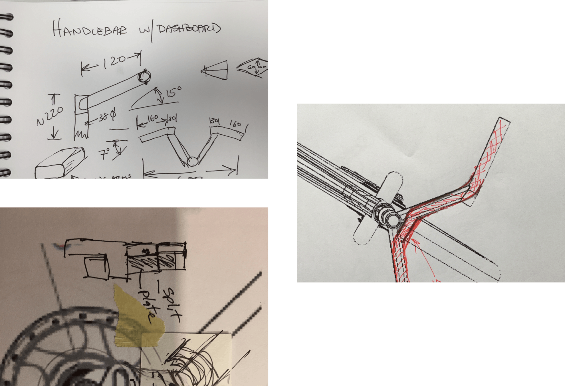
The initial stages involve a lot of sketching, trying out ideas, getting feedback and making changes.
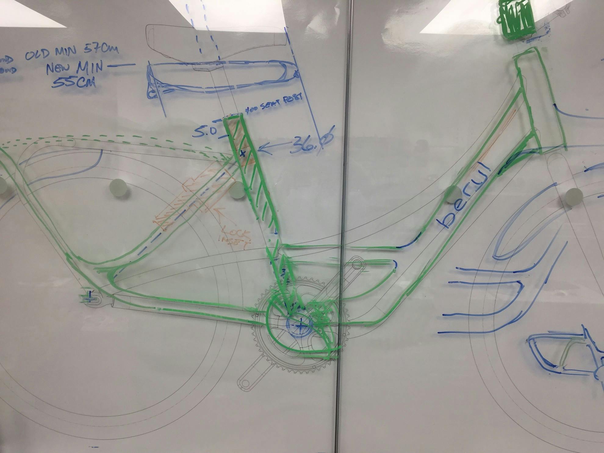
At one point, we put up a large scale sketch of a bike on one side of the glass walls in the workshop. We were then able to sketch changes on top of it.
All in all, between starting in August and the end of September, we had 21 different versions of the bike sketched out.
How did you make the bike look “Beryl”?
When I started, Beryl had just recently rebranded from Blaze, and there was a refreshed visual identity. Part of the new visual identity is the prism pattern, and initially we looked at how we could echo those patterns in the design of the bike to create something unmistakably “Beryl”. One idea was to have quite angular tubing, reflecting the angles of the prism. However, we also had to consider how the bike was going to be made and the parts we had available to us. So in the end we went with a round tube, which was a reliable, high-quality design already available on the market.
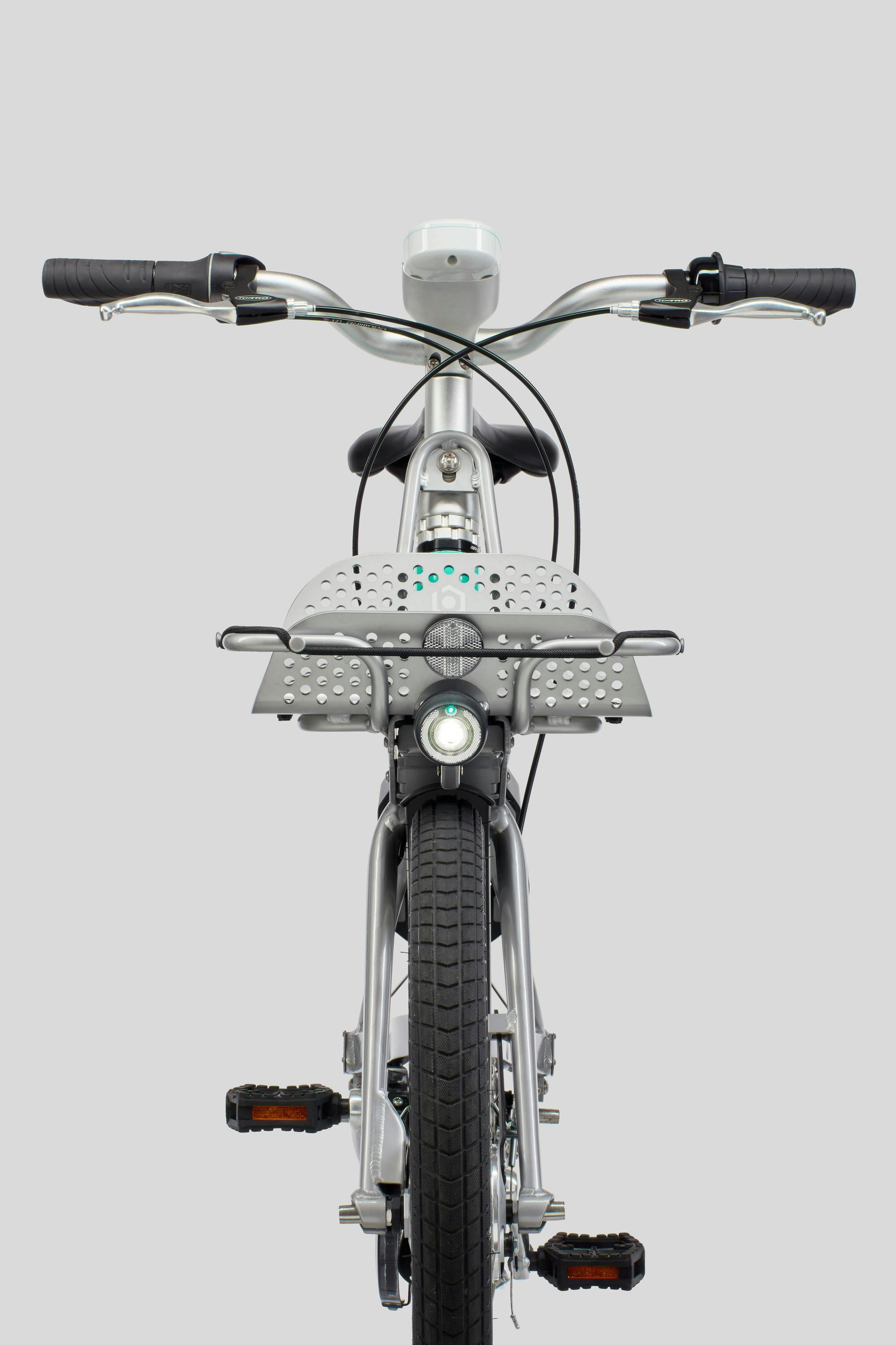
Some elements we added to the bike make it distinctly Beryl; the green that was chosen for the frame was matched as closely as possible to our brand identity. And our Laserlight front light features on every bike.
What other considerations did you have?
The bike carries quite a lot of technology so that it can be unlocked by a rider with their smartphone, and so it can communicate to the Beryl systems about its location and status. We had to carefully consider how to integrate that technology. Some parts of the bike have more than one function. For example, the basket is used by a rider to secure a bag or packages, but when not in use, it houses a solar panel to supply power to the electrical systems. All of that had to be worked into the design.
The other consideration we had was that we knew in the future we’d like to work on creating an electric bike. We wanted to make sure that the two bike frames shared enough design elements that they looked like they were from the same family, so some design decisions were made with the future in mind, to allow us to incorporate e-bike technology.
Tell us about the prototypes.
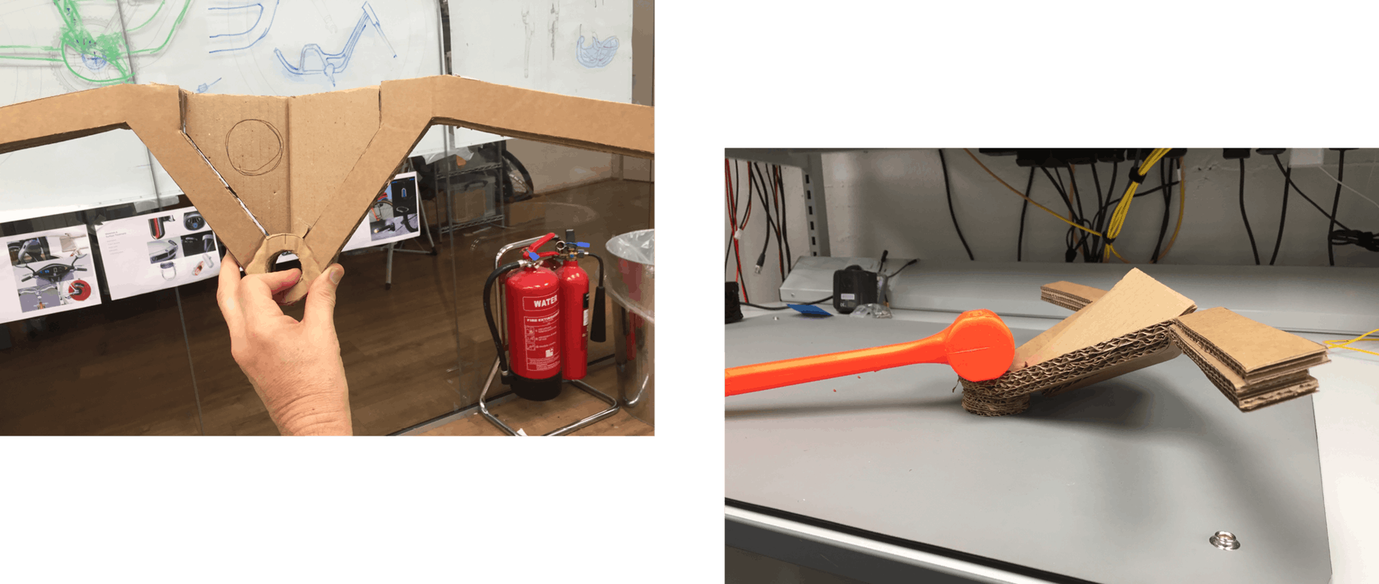
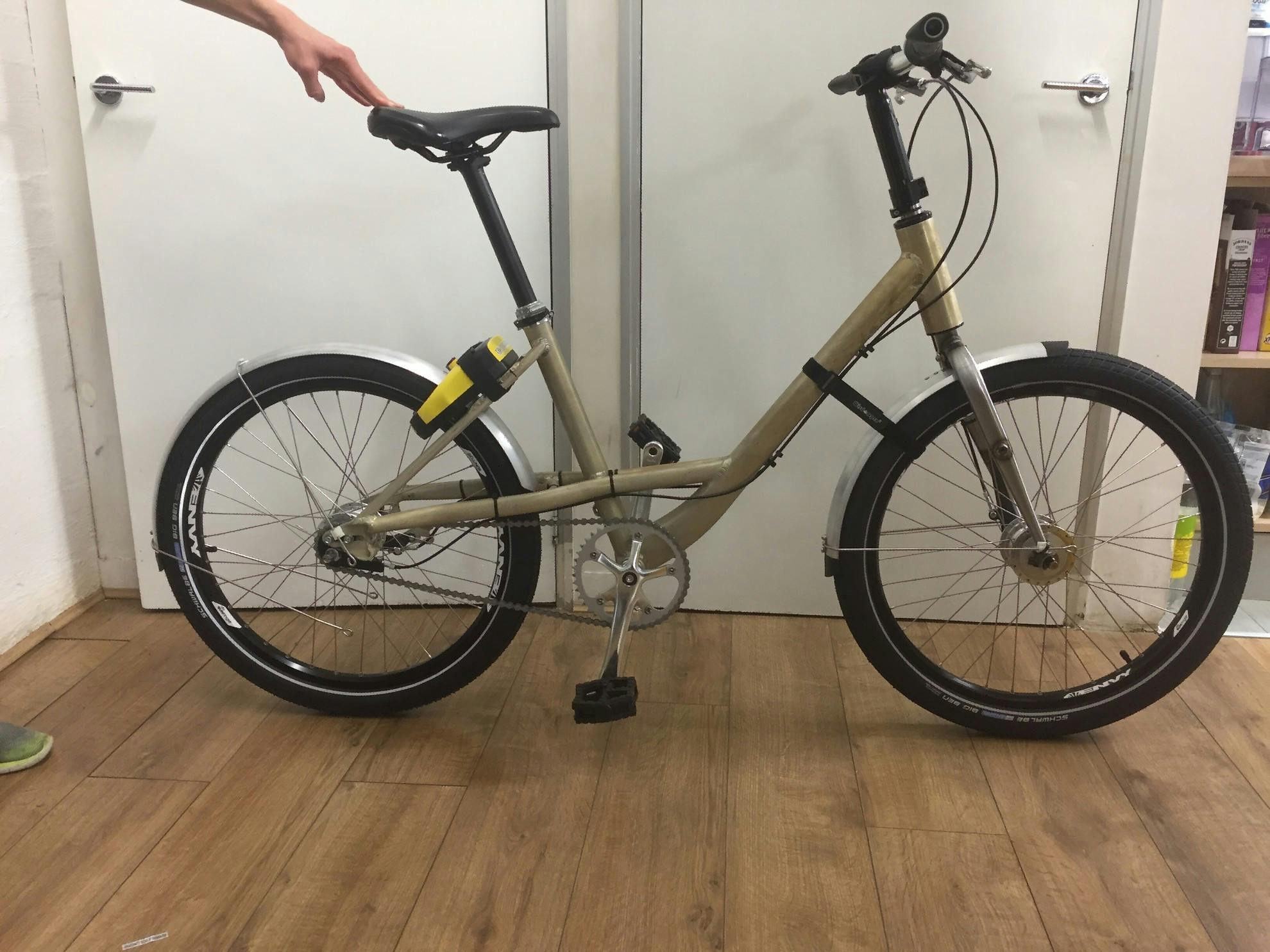
Once we had honed in on the shape of frame and decided on the other key elements we wanted such as the wheels, a couple of prototype frames were made. With the bikes at Beryl HQ, we were able to test them with real riders. Based on their feedback, I was able to make some tweaks, for example to the reach of the handlebars. Having the frame prototypes also let us try out some different designs for elements like baskets and the unlock unit. Some of these were made from cardboard just to get a feel for how they would look on a bike.
Dan Barnes (Beryl’s Design Director for Hardware) was then able to create versions much closer to the finished product using 3D printing.
Is the design ever really finished?
For shared bikes, it’s not until you get them out onto the streets in all the different cities you’re operating in that you get a feel for how riders will react. After many months of drawing, designing, testing prototypes and tweaking, we hit go on the first production run. However, we’ll always be testing and improving as we go. It’s a continual learning process - there’s no way to get it 100% right the first time.
In Part 2, we follow a bike on its journey as it is built in our factory, ready to be deployed on street in one of our live schemes.